DTC Ad Creative Inspiration
By - Jessie Healy, Webtopia CMO
Let’s dive into some of our favourite DTC Ad Creative from the past few months!
This ad is a fantastic example of a price objection-buster ad. Using the green-screen format to add authenticity - the ad takes a common objection to the premium product, and proceeds to show all the social proof and justification for the price - from the customer perspective. If you have lots of social proof, and people often object on price, this is the perfect format to bust the objection head-on. Agency Uknown but this ad has been running a while so we know it's working for the brand!
This ad is a fun and creative take on a greenscreen ad - in this a 'commentator is stating their objections to the product - and the brand representative then pops up to argue in their corner. It stops the scroll as well as helping to build the arguments for the product.
Here we have a 'negative hook' style ad. Although it's a bit of a bait and switch, if done well it can still be brand-positive, and a great way to stop the scroll and rebut any objections to or fears about your product. This ad ran for over 30 days and was give a winning score by Magic Brief. Agency unknown!
I like to call this format 'the founder explainer video' - where you have the founder or an employee walk the audience through the features of the product. What is cool about this ad is the use of really bold text to emphasise the message. One downside to this very slick, branded style is that it can sometimes be filtered out by people as it looks too much like 'an ad' - but I think in this case it totally works! This ad ran for 335 days so we can safely say it was working! Agency unknown!
This is a step away from UGC style adds to show this striking use of colour for a fashion ad. Ads in the fashion niche can be much more about aesthetics and strong simple use of design. This ad ticks all the boxes. According to Foreplay it's been live for 98 days - so we can assume it's working well for the brand.
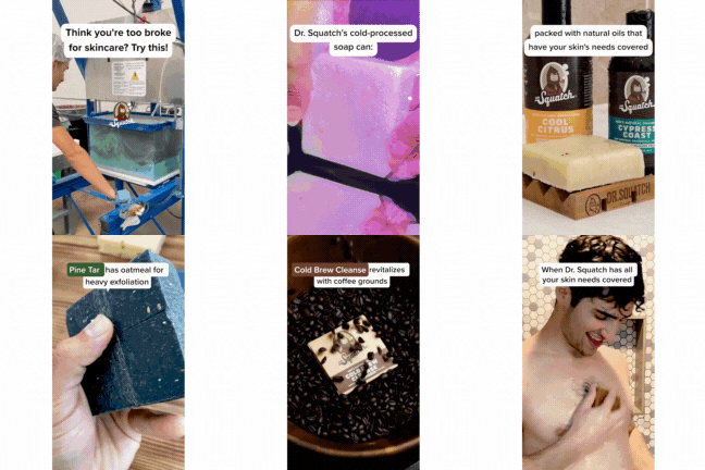
I love analysing Dr Squatch ads, because I know they spend a tonne on ads, and they have managed to scale a brand selling soap - a low AOV, very competitive category. This ad is a great example of an objection buster - appealing to the demographic who don't currently invest in their skincare. By positioning themselves as affordable compared to other skincare, they actually cleverly justify the price of their soap, which is actually a lot more expensive than standard soap. It's a great example of 'anchoring'. The other thing that is great here is the intriguing, curiosity-inducing hook video of the soap being made.
Continuing our healthfood theme for the coming new year - this is a great example of an ad that agitates a (literal) pain point of it's customer, creating a hook that is both relatable and also sparks curiosity for 'the solution'. It's fast-paced, authentic and shows a deep knowledge of their customer's problems and reasons to buy.
Top marks Ryze (agency unknown).
Here we are focussing on psychology - and how it can be used to drive action.
This ad leans into the herd effect and FOMO (fear of missing out).
By leading with a hook about selling out (again) they are playing into the human tendency to follow the herd. 'If others are buying it, so should I'. By mentioning this happens often they are giving us a fear of being the one in the herd who misses out.
They also cleverly demo the product and benefits while creating curiosity about what the product is.
Top marks to the team behind this.
Let's talk about using humour in ads. This ad uses humour and also does two things - it utilises the recognition and trust of a funny and popular creator (check out Shabaz Says, he's hilarious) with a message that highlights one key benefit of Hismile - the taste of their product. It's simple, to the point and memorable. It made me curious to know how this tastes!
Black Friday Edition.
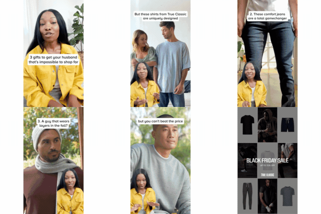
This ad from the DTC success story that is 'True Classic'. The angle is great 'gifts for men who are hard o shop for', which then leads into a clear articulation of the product benefits. The use of the greenscreen gives this a native paid-social format, and the UGC creator here feels like a friend letting you in on a secret. True Classic really have nailed ad creative, one of the reasons for their massive success
Don’t forget, our team are here to help accelerate your eCommerce business with Facebook, Google, TikTok and Pinterest ads and Klaviyo email marketing.
Let’s chat about your business and goals - email us on hello@webtopia.co


